Learning hub
A walk you through the early stages of the AR building process, so you're ready to jump in and form your reality.
Blippbuilder Academy
Welcome to
Blippbuilder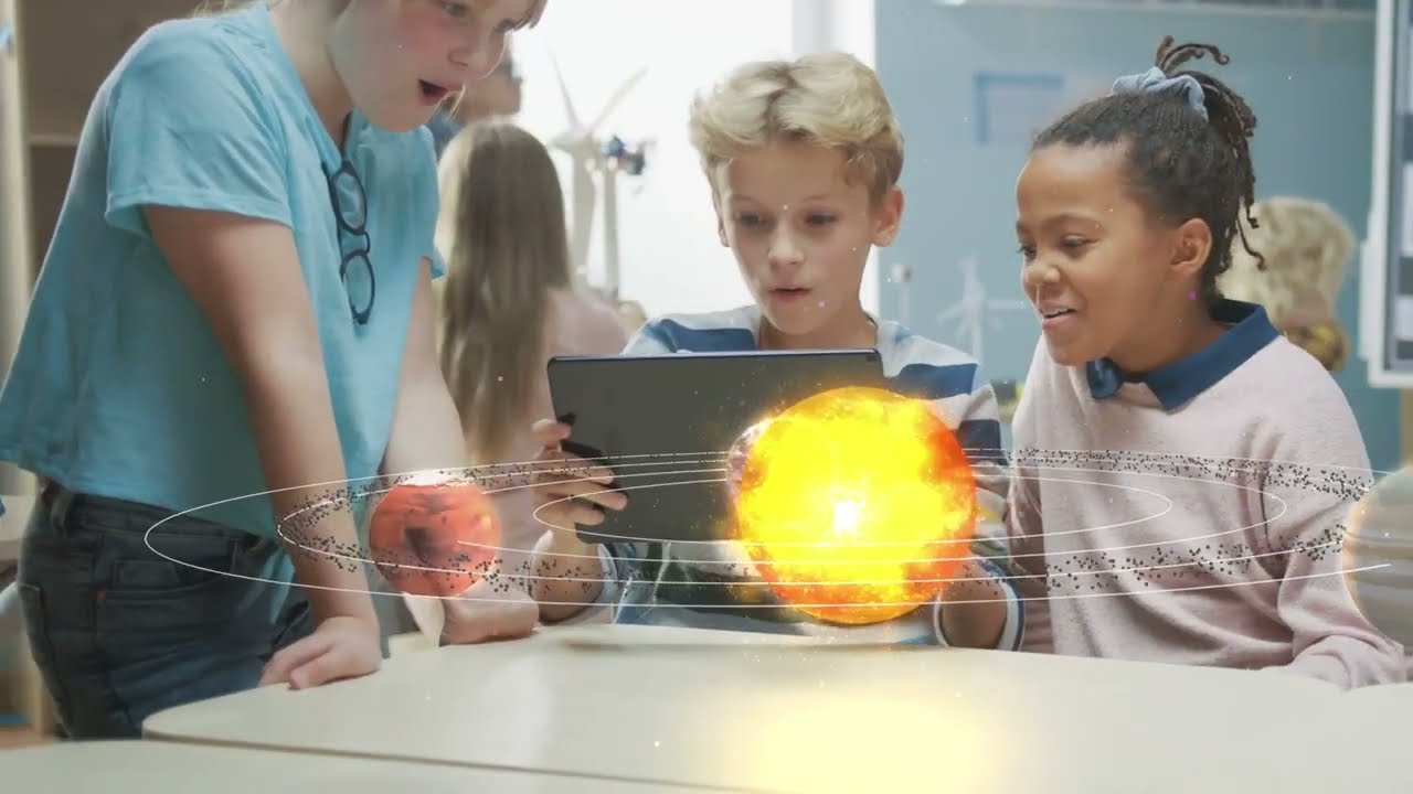
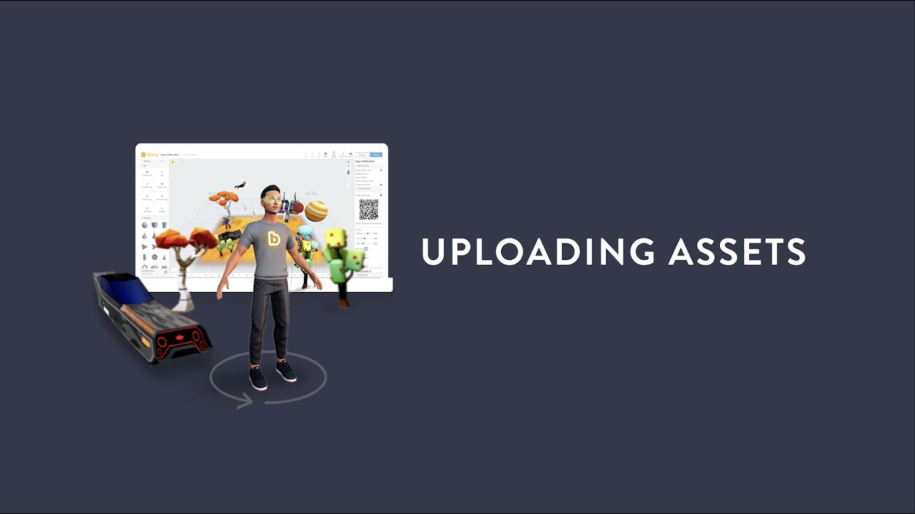
Learn how to upload assets
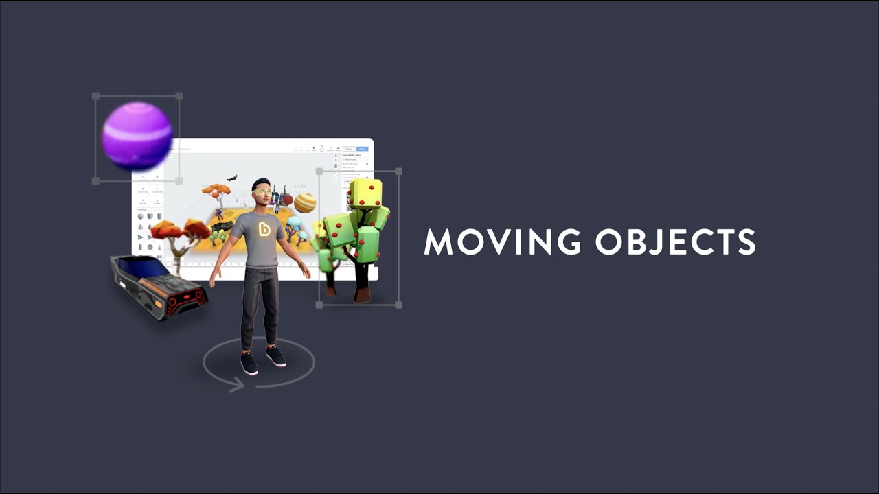
How to move objects around
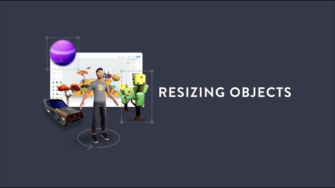
Learn how to resize objects
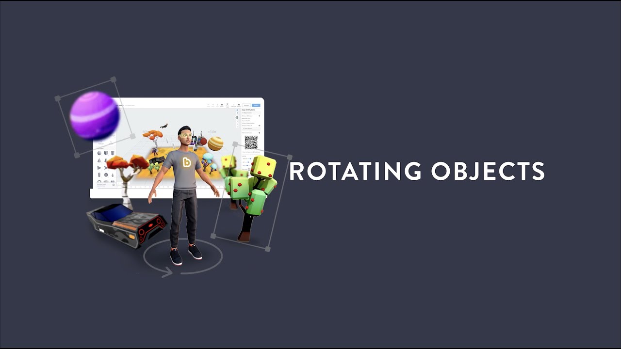
Learn how to rotate objects
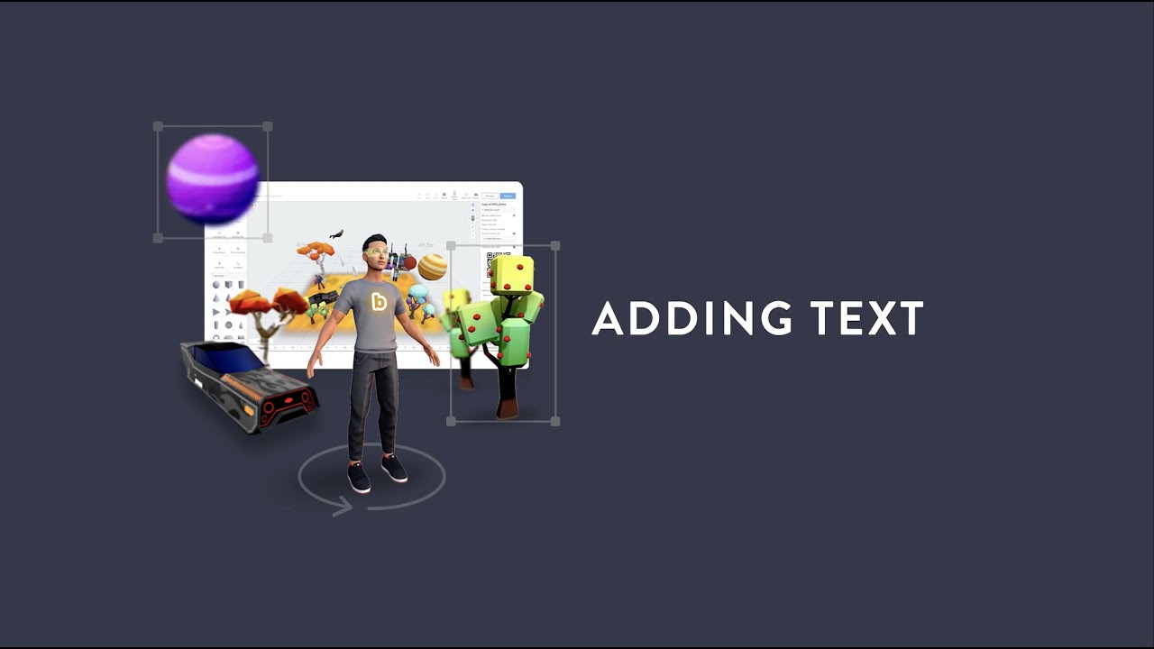
How to add text to your projects
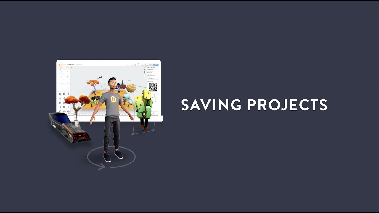
How your projects are saved
How to add audio to your projects
Preview your
AR projects
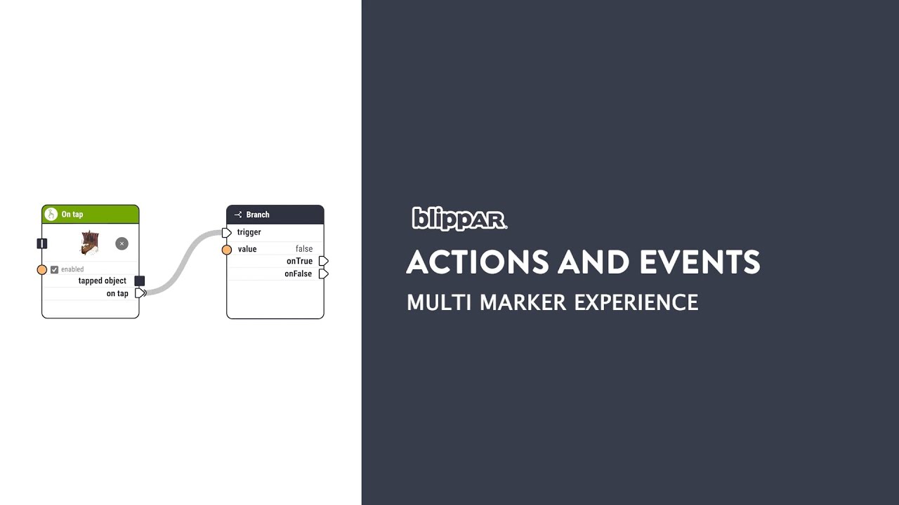
Introduction to Actions and Events
Understanding
nodes
Interactive with objects on tap

How to create multi-marker AR
How to use
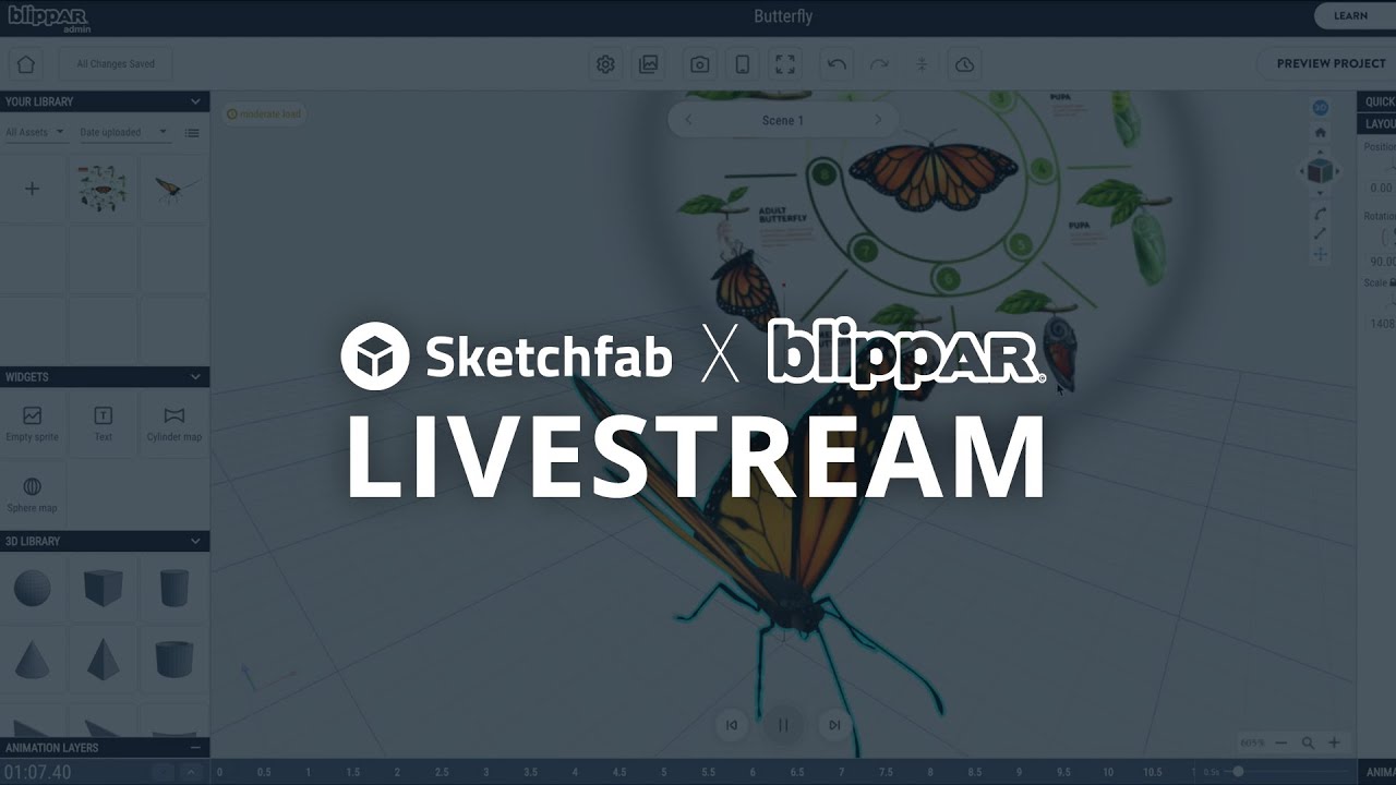
Sketchfab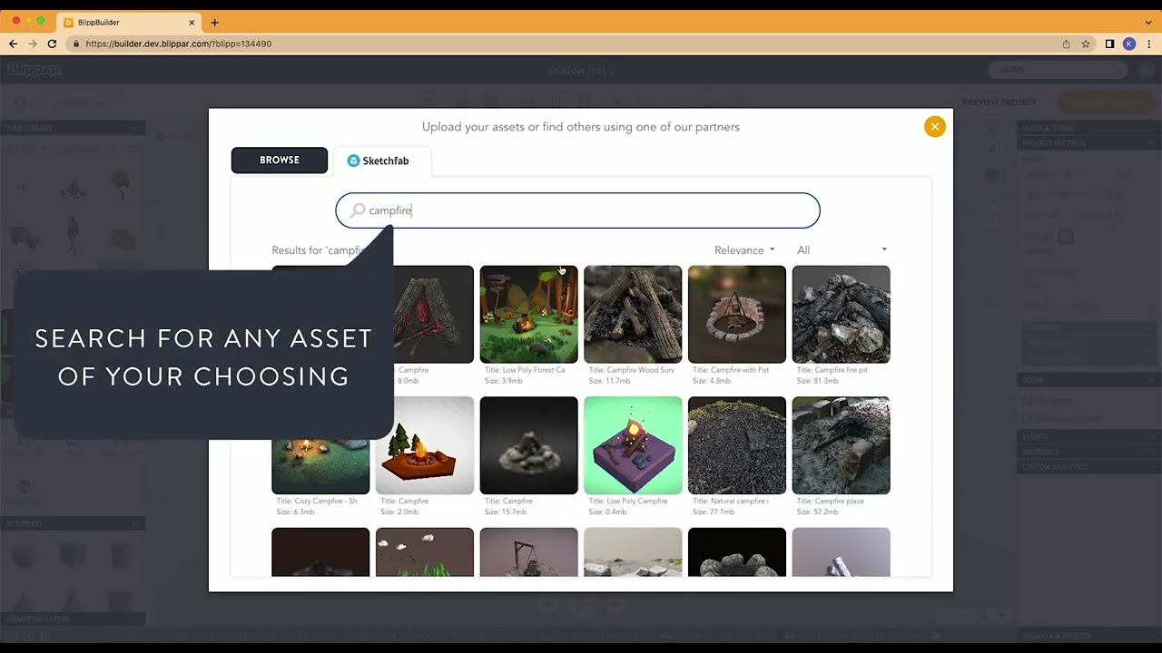
Blippar x Sketchfab Webinar